Quick Links 02
Overview
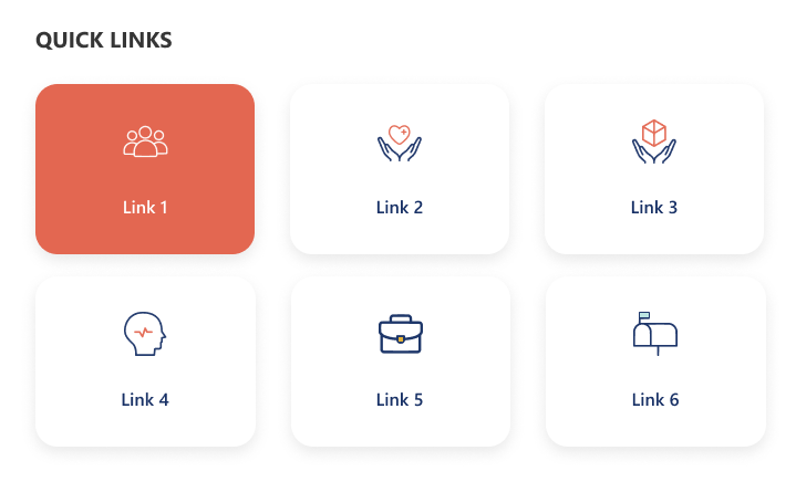
A minimal grid-style quick links design showcasing key resources with large icon buttons. The selected link is highlighted with a color accent for visual focus. It provides a clean and compact view ideal for quick navigation and content discovery.
Configuration
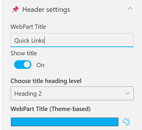
Header settings
📸 View Header Settings Screenshots
| Name | Purpose | Example / Options |
|---|---|---|
| WebPart Title | Specify a title for the Quick Links Web Part. | “Quick Links” |
| Choose title heading level | Select the heading level (H1–H6) for the WebPart title. | Heading 3 |
| Hide WebPart Title | Toggle to show or hide the WebPart title. | Show / Hide |
| WebPart Title (Theme-based) | Set a theme-based title color or style for the WebPart. | Color Picker |
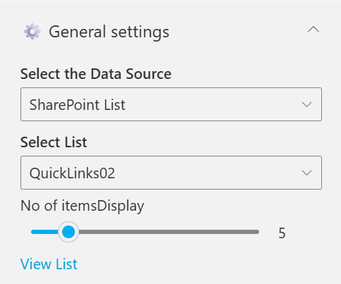
General settings
📸 View General Settings Screenshots
| Name | Purpose | Example / Options |
|---|---|---|
| Select the Data Source | Choose the data source type for fetching list items. [Sharepoint List, Collection Data, Data Collect from Panel] | SharePoint List |
| Select List | Choose which SharePoint list to display data from | QuickLinks02 |
| No of itemsDisplay | Control how many items should be displayed in the section. | Slider (e.g., 6) |
| View List | Open the SharePoint list directly in a new tab. | Link (View List) |
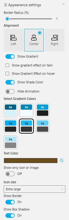
Appearance settings
📸 View Appearance Settings Screenshots
| Name | Purpose | Example / Options |
|---|---|---|
| Border Radius (%) | Adjusts the roundness of corners for items. | Slider (1%) |
| Alignment | Sets the alignment of content. | Left / Center / Right |
| Show Gradient | Enables gradient background for items. | On / Off |
| Show Gradient Effect on Item | Applies gradient only to selected items. | Checkbox |
| Show Gradient Effect on Hover | Displays gradient when hovering over items. | Checkbox |
| Show Shade Color | Adds a shading overlay for depth. | On / Off |
| Hide Animation | Disables animations for a static appearance. | Toggle |
| Select Gradient Colors | Choose color pairs for gradient effects. | Multiple preset swatches |
| Text Color | Sets the color of text elements. | Color Picker (Brown) |
| Show Only Icon or Image | Displays only icons or images without text. | On / Off |
| Icon Size | Adjusts icon size within the web part. | Extra large |
| Show Border | Toggles border visibility around elements. | On / Off |
| Show Box Shadow | Adds or removes a shadow behind boxes or items. | On / Off |