Quick Links 01
Overview
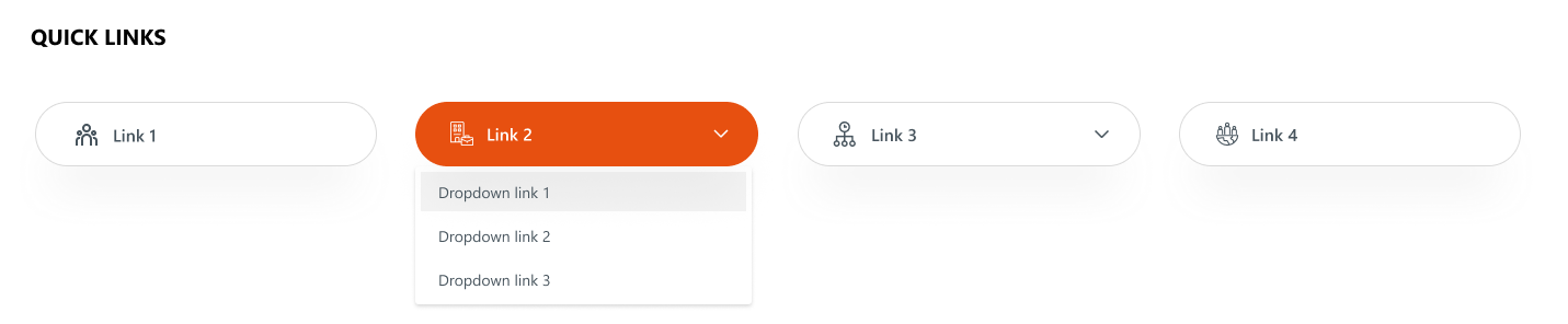
An enhanced quick links layout where certain links include dropdowns for sub-links. It combines clean icons, rounded button styling, and contextual navigation options. This format supports hierarchical navigation, making it suitable for displaying grouped or related quick links.
Configuration
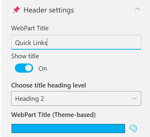
Header settings
📸 View Header Settings Screenshots
| Name | Purpose | Example / Options |
|---|---|---|
| WebPart Title | Specify a title for the Quick Links Web Part. | “Quick Links” |
| Choose title heading level | Select the heading level (H1–H6) for the WebPart title. | Heading 3 |
| Hide WebPart Title | Toggle to show or hide the WebPart title. | Show / Hide |
| WebPart Title (Theme-based) | Set a theme-based title color or style for the WebPart. | Color Picker |
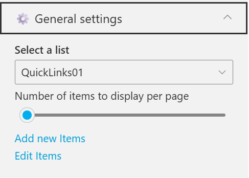
General settings
📸 View General Settings Screenshots
| Name | Purpose | Example / Options |
|---|---|---|
| Select List | Choose which SharePoint list to display data from. | QuickLinks |
| Number of items to display per page | Define the maximum number of quick links to display per page. | Slider (e.g., 3) |
| Add New Items | Shortcut to add new list items directly. | Link (Add New Items) |
| Edit Items | Opens the selected list to modify existing entries | Link (Edit Items) |
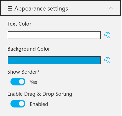
Appearance settings
📸 View Appearance Settings Screenshots
| Name | Purpose | Example / Options |
|---|---|---|
| Text Color | Set the text color for items or labels in the web part. | Color Picker(White) |
| Background Color | Choose a background color for the section or item area. | Color Picker (Blue) |
| Show Banner | Display a banner background behind the title. | Checkbox |
| Show Border? | Toggle the border visibility for the displayed items. | Yes / No |
| Enable Drag & Drop Sorting | Allow users to reorder items within the web part easily. | Enabled / Disabled |