Configuration
This document explains how to configure each web part in your intranet solution, including setup details, list configurations, and property pane options.
📑 Table of Contents
🧭 1. Top Navigation
A minimalist top navigation bar providing easy access to essential intranet sections. Menus are fully customizable to match your organization’s needs.

🧱 List Configuration
Create a SharePoint list with the following columns:
| 🏷️ Column Name | 🔣 Type | Description |
|---|---|---|
| Icon | Image | Displays the navigation icon |
| URL | Hyperlink | Target link for each item |
| Order | Number | Defines item order |
| TargetWindow | Choice (Yes/No) | Opens in a new tab if set to “Yes” |
⚙️ Property Pane Settings
📸 View Property Pane Screenshots
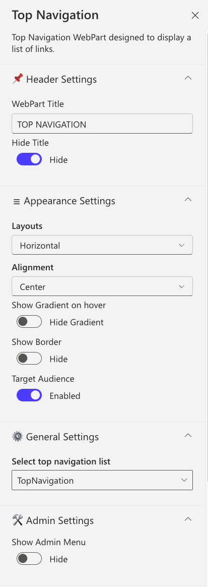
Header Settings
| Name | Purpose | Option |
|---|---|---|
| WebPart Title | Customize the title displayed above the navigation bar | TOP NAVIGATION |
| Hide Title | Conceal the title to create a cleaner, more minimalist appearance | Show / Hide |
Appearance Settings
| Name | Purpose | Option |
|---|---|---|
| Layout | Select the arrangement of navigation items (currently horizontal) | Horizontal |
| Alignment | Control the horizontal positioning of navigation items | Left / Center / Right |
| Show Gradient on Hover | Add a subtle gradient effect when users hover over navigation items | Show / Hide |
| Show Border | Display a border frame around the entire navigation component | Show / Hide |
| Border Color | Choose the color of the navigation border for brand consistency | Color Picker |
| Target Audience | Restrict navigation visibility to specific user groups or audiences | Optional |
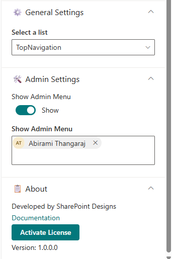
General Settings
| Name | Purpose | Option |
|---|---|---|
| Select top navigation list | Choose the SharePoint list containing your navigation menu items | TopNavigation |
Admin Settings
| Name | Purpose | Option |
|---|---|---|
| Show Admin Menu | Display an additional menu section exclusive to administrators | Show / Hide |
| Admin Users | Specify which users have access to the admin-only menu features | (User names) |
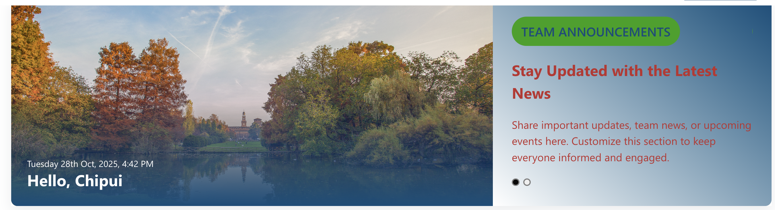
🎉 2. Welcome Banner
A personalized banner greeting the user by name and time, while promoting your organization’s Vision, Mission, and Values.
⚙️ Configuration
📸 View Property Pane Screenshots
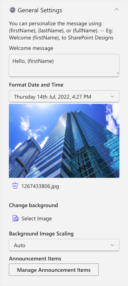
General Settings
| Name | Purpose | Example |
|---|---|---|
| Welcome Message | Defines the greeting text displayed to users. Supports tokens such as {firstName}, {lastName}, and {fullName} for personalization. | Welcome, {firstName} |
| Format Date and Time | Configures how the current date and time are presented within the component. | Monday, 14 Aug 2023, 3:45 PM |
| Change Background | Allows uploading a custom banner image to be used as the background. | Upload via Image Picker |
| Background image scaling | Controls how the background image is resized or fitted within the banner area. | Options: Cover, Auto, Contain |
| Manage Announcement Items | Provides a collection field to add and manage the announcements displayed in the carousel. | Add items through a property collection |
| Text Color | Sets the default color for paragraph-level text within the component. | Select a color using the Color Picker |
| Font Sizes | Configures the font sizes for badges, headings, and paragraph elements. | Adjust using slider controls |
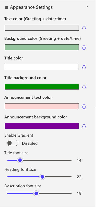
Appearance Settings
| Name | Purpose | Example |
|---|---|---|
| Text color (Greeting + date/time) | Sets the color of the greeting message and the displayed date/time text. | Choose a preferred text color |
| Background color (Greeting + date/time) | Defines the background color applied behind the greeting and date/time section. | Select a background color |
| Title color | Specifies the text color for announcement titles. | Pick a title color |
| Title background color | Sets the background color for the announcement title area. | Choose a background color |
| Announcement text color | Configures the color used for general announcement text. | Select from the color palette |
| Announcement background color | Determines the background color for the announcement card container. | Use the Color Picker |
| Enable Gradient | Toggles a gradient overlay on the banner image and announcement card when activated. | Enable via toggle switch |
| Title font size | Adjusts the font size for announcement titles. | Modify using slider control |
| Heading font size | Adjusts the font size for announcement headings. | Modify using slider control |
| Description font size | Sets the font size for the announcement description text. | Adjust using slider control |
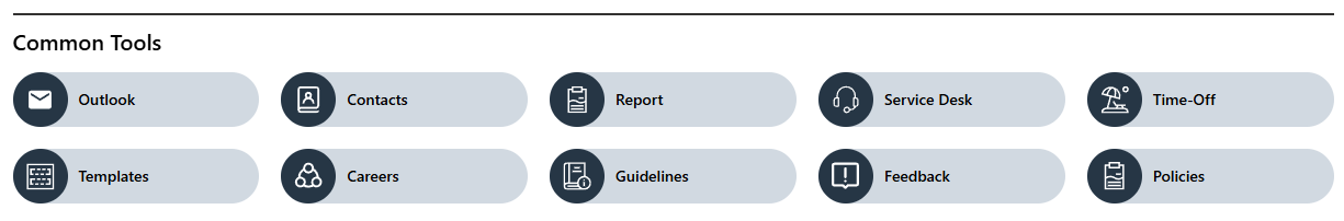
🔗 3. Common Tools
Provides quick access to essential tools, apps, and documents for daily use with clean icons and labels.
🧱 List Configuration
| Column Name | Type | Description |
|---|---|---|
| Icon | Image | Tool icon |
| Link | Hyperlink | Target URL |
| OrderBy | Number | Sort order |
| OpenIn | Choice (Yes/No) | Opens in a new window |
⚙️ Property Pane Settings
📸 View Property Pane Screenshots
| Category | Name | Purpose | Option |
|---|---|---|---|
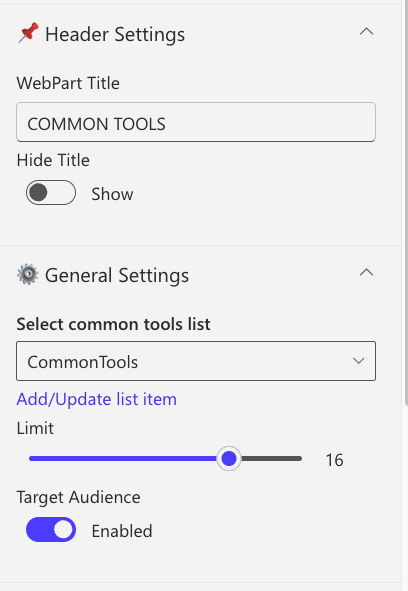
| Header | WebPart Title | Title displayed at top | COMMON TOOLS |
| Header | Hide Title | Toggle visibility | Show / Hide |
| General | Select a list | Choose SharePoint list | CommonTools |
| General | Limit | Number of links to show | 1–50 |
| General | Target audience | Restrict navigation visibility to specific user groups or audiences | Group name |
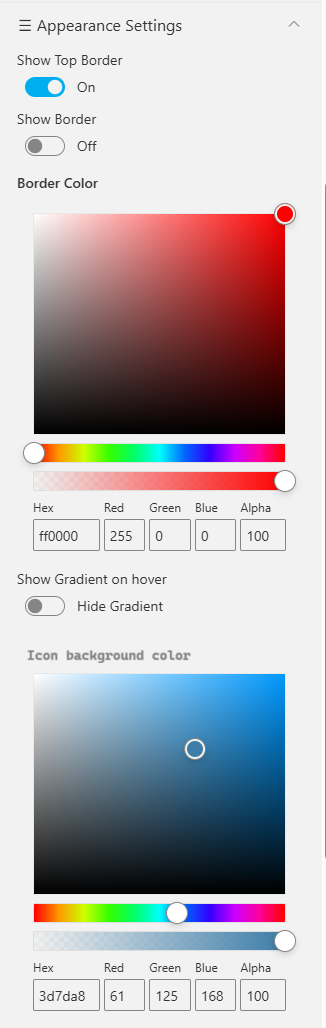
| Appearance | Show Top Border | Toggle sharp top border | On / Off |
| Appearance | Border Color | Select border color | Color Picker |
| Appearance | Show Gradient on Hover | Highlight link on hover | Color Picker |
| Appearance | Icon Background Color | Change icon background | Color Picker |
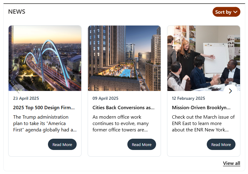
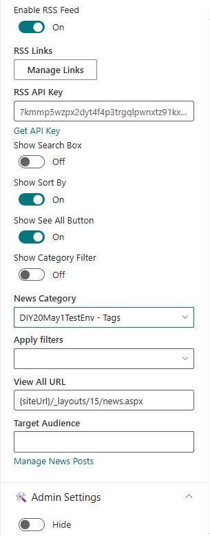
📰 4. News
Showcase concise company updates in a clean, minimal layout. Integrates with SharePoint news or RSS feeds.
⚙️ Configuration
📸 View Property Pane Screenshots
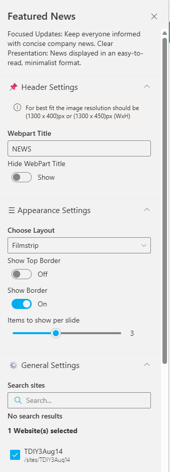
Header Settings
| Name | Purpose | Option |
|---|---|---|
| WebPart Title | Custom title for web part | NEWS |
| Hide Title | Toggle visibility | Show |
| Image Resolution | Recommended image size | 1300x400px |
General Settings
| Name | Purpose | Example |
|---|---|---|
| Search Sites | Select source sites | Current site |
| Enable RSS Feed | Enable RSS integration | On |
| RSS Links | Manage external feeds | [Manage Links] |
| Show See All Button | Adds “See All” button | On |
| Show Category Filter | Enables category-based filtering | Off |
| View All URL | URL for full list | {siteUrl}/_layouts/15/news.aspx |
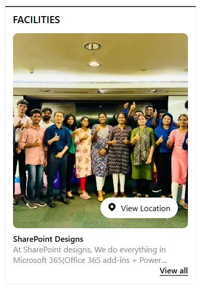
🏢 5. Facilities
Highlight your organization’s facilities, offices, or departments using a clean, visual layout.
🧱 List Configuration
| Column | Type | Description |
|---|---|---|
| Content | Multiple lines of text | Facility description |
| Thumbnail | Image | Facility image |
| OrderBy | Number | Sort order |
| Address Location | Multiple lines of text | Address info |
⚙️ Property Pane Settings
📸 View Property Pane Screenshot
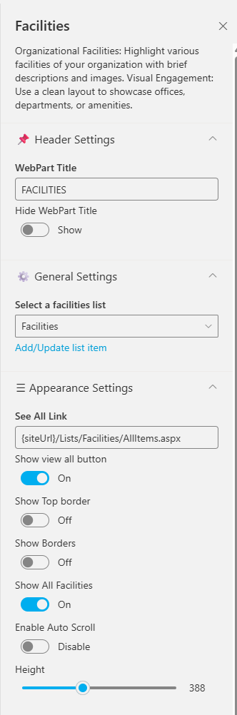
| | Name | Purpose | Option |
|---|---|---|
| WebPart Title | Display title | FACILITIES |
| Hide Title | Toggle visibility | Show |
| Select a list | Choose SharePoint list | Facilities |
| See All | URL for full list | {siteUrl}/Lists/Facilities/AllItems.aspx |
| Show Top Border | Toggle top border | On / Off |
| Show Borders | Add border around web part | On / Off |
| Enable Auto Scroll | Auto-scroll carousel | On / Off |
| Height | Set height (px) | 388 |
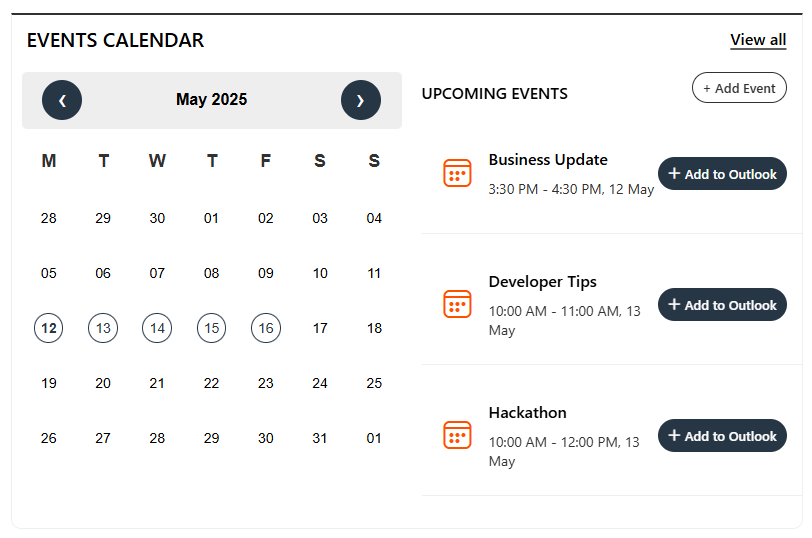
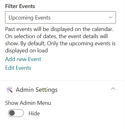
📅 6. Events Calendar
Display and manage upcoming company events, meetings, and important dates.
⚙️ Configuration
📸 View Property Pane Screenshots
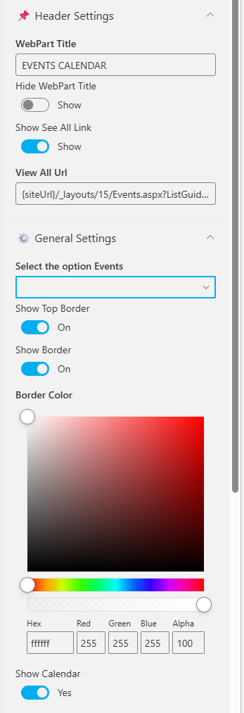
| Name | Purpose | Example |
|---|---|---|
| WebPart Title | Title of the section | EVENTS CALENDAR |
| Show See All Link | Link to full event list | Show |
| View All URL | URL to all events | {siteUrl}/_layouts/15/Events.aspx |
| Select the option events | Choose event source | SharePoint / Mailbox / Current User |
| Filter Events | Show upcoming or past events | Upcoming Events |
| Add/Edit Events | Manage list items | Add/Edit Events |
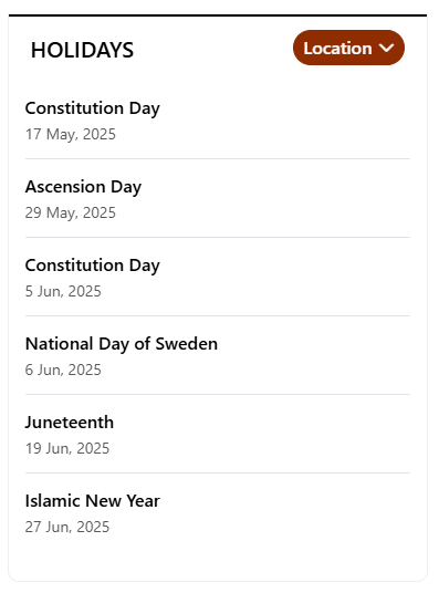
🎈 7. Holidays
Highlight upcoming public holidays or company days off to help employees plan ahead.
🧱 List Configuration
| Column | Type | Description |
|---|---|---|
| Description | Multiple lines of text | Holiday details |
| HolidayLink | Hyperlink | External link (if any) |
| StartDate | Date and Time | Holiday date |
| Location | Choice | Location-based |
⚙️ Property Pane Settings
📸 View Property Pane Screenshot
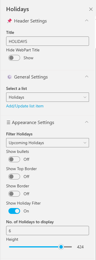
| Name | Purpose | Option |
|---|---|---|
| Title | Title for web part | |
| Hide Title | Toggle visibility | Show / Hide |
| Select a list | Choose source list | Holidays |
| Filter Holidays | Filter type | All / Upcoming / Past |
| Show Bullets | Display icons beside holidays | On / Off |
| Show Borders | Show/hide border | On / Off |
| Border Color | Pick border color | Color Picker |
| No. of Holidays to Display | Limit results | 6 |
| Height | Adjust component height | 424 |
📘 Developed by: SharePoint Designs