Spotlight 04
Overview
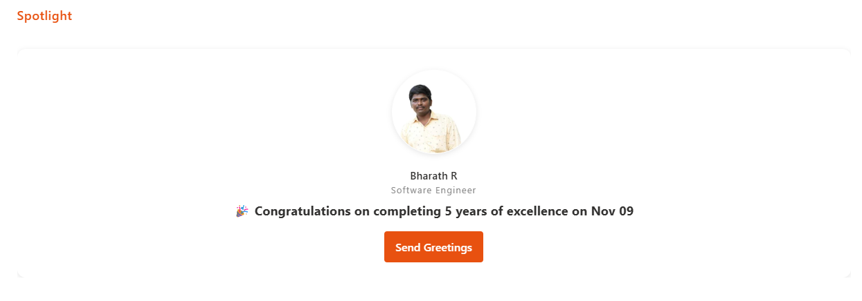
This web part highlights upcoming Birthdays, Work Anniversaries, and New Joiners from your organization, using data stored in a SharePoint list. Users can quickly browse employee milestones and send greetings with ease. It provides an engaging, celebratory experience that keeps your team connected and informed.
Configuration
Header Settings
📸 View Header Settings Screenshots
| Name | Purpose | Example / Options |
|---|---|---|
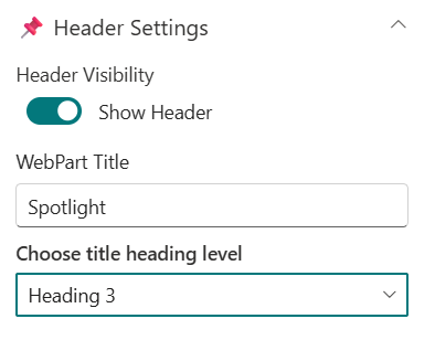
| Header Visibility | Toggle to show or hide the Web Part title | Show Header/Hide Header |
| WebPart Title | Specify a title for the Spotlight Web Part. | “Spotlight” |
| Choose title heading level | Select the heading level (H1–H4) for the WebPart title. | Heading 3 |
General Settings
📸 View General Settings Screenshots
| Name | Purpose | Example / Options |
|---|---|---|
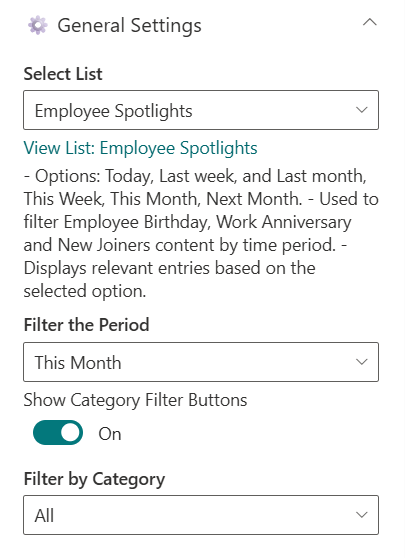
| Select List | Choose which SharePoint list to display data from. | Employee Spotlights |
| Filter the Period | Select a filter period for displaying data | Dropdown |
| Show Category Filter Buttons | Toggle to show category filter | On/Off |
| Filter by Category | To display a particular category alone. | Dropdown |
Appearance Settings
📸 View Appearance Settings Screenshots

| Name | Purpose | Example/Options |
|---|---|---|
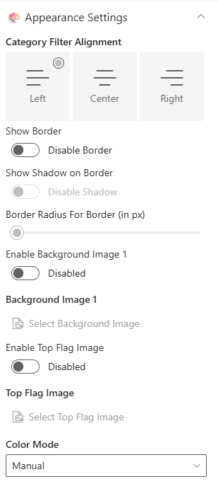
| Category Filter Alignment | Select the desired alignment for the filter category | Choice |
| Show Border | Toggle to show or hide the border | On/Off |
| Show Shadow on Border | Toggle to show or hide the shadow for border | On/Off |
| Border Radius For Border (in px) | Adjusts the roundness of corners for items. | Slider(8px to 25px) |
| Enable Background Image 1 | Toggle to show or hide the Background Image | Enabled/Disabled |
| Background Image 1 | Upload a custom background image | Image Picker |
| Enable Top Flag Image | Toggle to show or hide the Top Flag Image | Enabled/Disabled |
| Top Flag Image | Upload a custom top flag image | Image Picker |
| Color Mode | Select the color mode to pick for elements | Dropdown |
| Title and Greeting Message | Select the color for title and greeting message | Color Picker |
| Webpart Title, Category | Select the color for webpart title and category | Color Picker |
Carousel Settings
📸 View Carousel Settings Screenshots

| Name | Purpose | Example/Options |
|---|---|---|
| Enable Auto Play | Toggle to enable or disable the autoplay in carousel | Enabled/Disabled |
| Auto Play Speed (seconds) | Adjust the Slider to control the speed of autoplay in carousel | Slider |
Admin Settings
📸 View Admin Settings Screenshots

| Name | Purpose | Example/Options |
|---|---|---|
| Show Admin Menu | Toggle to show or hide the Admin Menu | Show/Hide |
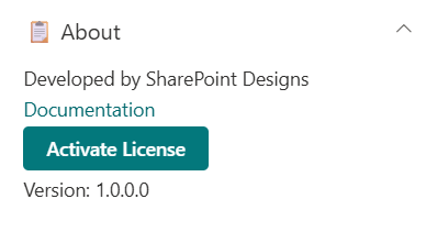
About
📸 View About Screenshots
| Name | Purpose |
|---|---|
| Developer Info | Indicates the web part is built by SharePoint Designs. |
| Documentation Link | Links to this documentation for easy reference. |
| Activate License | Button to activate the licensed or premium version if applicable. |