Configuration settings for each web part.
👋 1. Announcement
📋 Details
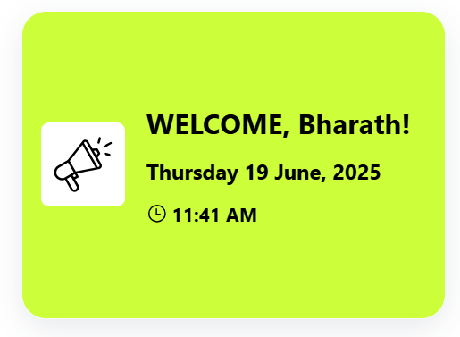
- Personalized Notification: Shows a warm welcome message tailored to the user's name with date and time info.
- Warm Introduction Snippet: Short, effective greeting module to kickstart new users’ day with positivity.
- Friendly Message Tile: Vibrant visual welcome designed to make new joiners feel instantly noticed.
🛠️ Announcement Web Part – Property Pane Configuration
Configuration options are grouped under intuitive sections:
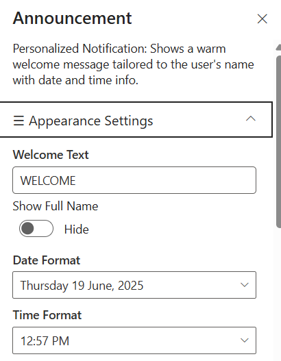
🎨 Appearance Settings
📸 View Property Pane Screenshots
| Field | Type | Default / Example | Description |
|---|
| Welcome Text | Textbox | WELCOME | Displays a greeting with the current user's first name, above the date/time. |
| Show Full Name | Toggle | Off | If enabled show full name orelse show first name. |
| Date Format | Dropdown | Thursday 19 June, 2025 | Select which date format required for Announcement. |
| Time Format | Dropdown | 12:50 PM | Select which time format reqyired for Announcement. |
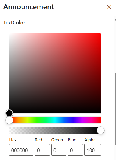
| Text Color | Color Picker | #000000 | Customizes the text color for Announcement. |
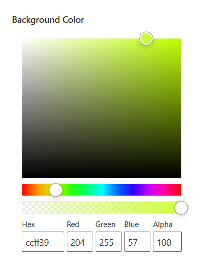
| Background Color | Color Picker | #CCFF39 | Customizes the background color for Announcement. |
ℹ️ About Section
📸 View Property Pane Screenshots
| 🏷️ Name | 🎯 Purpose |
|---|
| Developer Info | Indicates the web part is built by SharePoint Designs. |
| Documentation Link | Links to this documentation for easy reference. |
| Activate License | Button to activate the licensed or premium version if applicable. |
📌 Usage Notes
- Position the announcement at the top of the homepage or dashboard to ensure maximum visibility and create a strong first impression for new employees.
- Tooltip has added for welcome header part if name is too long it will shorthen and show it with (...)
- Ensure adequate contrast for text readability and screen-reader compatibility for user inclusivity.
- Color pickers support Hex, RGB, and Alpha transparency formats.
2. 🔗 Quick Links
📋 Details
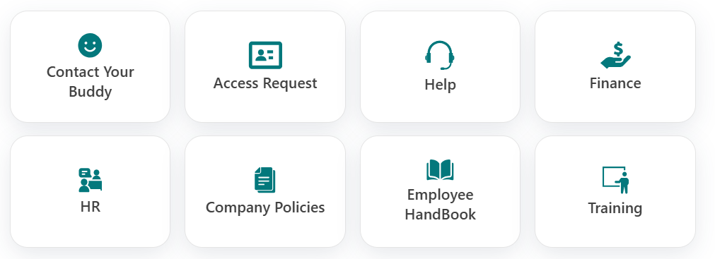
- Essential Resources: Provide immedia4e access to frequently used tools and documents.
- Minimalist Icons: Use clean icons and labels for straightforward navigation.
List Config
For the Quick Links webpart, create a list with the following columns.
📋 Required Columns
| 🏷️ Column Name (Case Sensitive) | 🔣 Column Type | Column Value |
|---|
| Icon | Image | Any of the image |
| Title | Text | Any Title for Quick Link |
| TargetWindow | Choice | Open in New Window, Open in Same Window (Provide Specified Choice alone) |
| Link | Hyperlink | Any URL for Quick Link |
🛠️ Quick Link Web Part – Property Pane Configuration
- The Quick Links web part offers centralized access to frequently used external applications and team tools. It improves efficiency by simplifying access to all essential resources from one place.
📸 View Property Pane Screenshots
| Field | Type | Default / Example | Description |
|---|
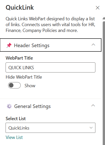
| WebPart Title | Textbox | QUICK LINKS | Title displayed at the top of the web part. |
| Hide WebPart Title | Toggle | Off | Toggle to show or hide the web part title. |
⚙️ General Settings
| Field | Type | Default / Example | Description |
|---|
| Select List | DropDown | QuickLinks | Specifies the SharePoint list to pull quick links. |
| View List | Hyperlink | - | On Click of it, will redirect to particular list. |
📌 Usage Notes
- Position the Quick Links section prominently on the dashboard to serve as the go-to entry point for frequently accessed tools and resources.
- Each tile should feature a descriptive label and a relevant, professional icon to aid quick recognition and accessibility.
- WebPart Title can be Toggled Off to get better UI experience.
3. 💬 Welcome Message from CEO
📋 Details
- A message from the CEO that outlines strategic priorities and encourages unity across the organization.
- Highlights company goals, cultural values, and the importance of teamwork from the CEO’s perspective.

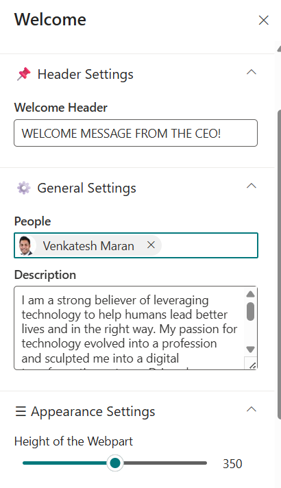
🛠️ Welcome Message from CEO Web Part – Property Pane Configuration
This web part offers flexible configuration grouped into the following categories:
- Header Settings
- General Settings
- Appearance Settings
- About
📸 View Property Pane Screenshots
| Field | Type | Default / Example | Description |
|---|
| Welcome Header | Textbox | WELCOME MESSAGE FROM CEO | Title displayed at the top of the web part. |
⚙️ General Settings
| Field | Type | Default / Example | Description |
|---|
| People | People Picker | Higher Authority People (Ex. CEO) | Select the People from Organization in the list |
| Description | Multi Line Text | I am a strong believer... | Main body text of the CEO message |
🎨 Appearance Settings
| Field | Type | Default / Example | Description |
|---|
| Height of the Webpart | Slider | 355px | Customize the Height of description. |
📌 Usage Notes
- Customize the Height to get better UI and it can customized from 200px to 700px.
- ToolTip has added for description content & Webpart Title too.
- On Hover of the Person it will display the team card contains all details about profile.
4. 👥 Meet The Team
📋 Details
👩💼 Subject Matter Experts Showcase Highlight key team members and their expertise to help employees connect with the right people.
- Enhanced Visibility: Showcase SMEs to increase awareness and foster collaboration.
- Interactive Design: Optional carousel for dynamic presentation

List Config
For the Meet The Team webpart, create a list with the following columns.
📋 Required Columns
| 🏷️ Column Name (Case Sensitive) | 🔣 Column Type | Column Value |
|---|
| Role | Text | Role of the person |
| Icon | Image | Image of the person |
| TargetWindow | Choice | Open in New Window, Open in Same Window (Provide Specified Choice alone) |
| TeamPerson | Person or Group | Person from Organization |
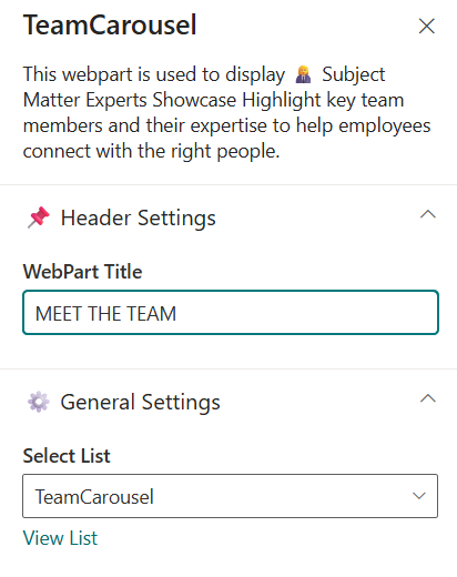
🛠️ Meet The Team Web Part – Property Pane Configuration
📸 View Property Pane Screenshots
| Field | Type | Default / Example | Description |
|---|
| WebPart Title | Textbox | MEET THE TEAM | Title displayed at the top of the web part. |
⚙️ General Settings
| Field | Type | Default / Example | Description |
|---|
| Select List | DropDown | TeamCarousel | Specifies the SharePoint list to pull teamcarousel. |
| View List | Hyperlink | - | On Click of it, will redirect to particular list. |
📌 Usage Notes
- Ensure the Team Person column is populated for each team member. This should reference a valid user from your organization directory.
- If the Role column is filled, that value will be shown in the UI. If left blank, the role will be auto-fetched from the Team Person's user profile.
- Similarly, if the Icon column is filled, that icon will be shown in the UI. If left blank, the profile picture will be automatically retrieved from the Team Person's user profile.
- The Name and Profile Picture will be automatically retrieved based on the selected Team Person.
- On Hover of the Person it will display the team card contains all details about profile.
5. 🌐 Build Connections
📋 Details
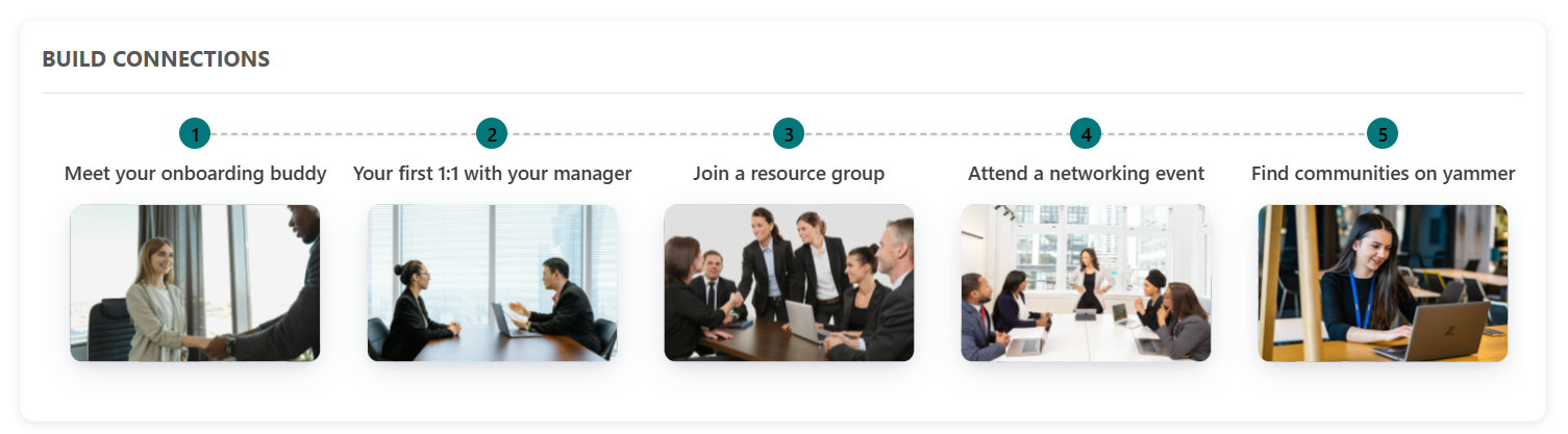
- The Build Connections web part is designed to help new employees quickly connect with key individuals across the organization.
- It highlights colleagues they may want to reach out to during their onboarding journey — such as buddies, mentors, team leads, or cross-functional collaborators.
List Config
For the Build Connections webpart, create a list with the following columns.
📋 Required Columns
| 🏷️ Column Name (Case Sensitive) | 🔣 Column Type | Column Value |
|---|
| Title | Text | Any Title for build connections |
| Icon | Image | Image for build connections |
| TargetWindow | Choice | Open in New Window, Open in Same Window (Provide Specified Choice alone) |
| Link | Hyperlink | Any URL for Quick Build COnnections |
🛠️ Build Connections Web Part – Property Pane Configuration
📸 View Property Pane Screenshots
| Field | Type | Default / Example | Description |
|---|
| WebPart Title | Textbox | BUILD CONNECTIONS | Title displayed at the top of the web part. |
⚙️ General Settings
| Field | Type | Default / Example | Description |
|---|
| Select List | DropDown | BuildConnections | Specifies the SharePoint list to pull buildConnections. |
| View List | Hyperlink | - | On Click of it, will redirect to particular list. |
🎨 Appearance Settings
| Field | Type | Default / Example | Description |
|---|
| Items to display | Slider | 5 | Customize the items to display in build connections. |
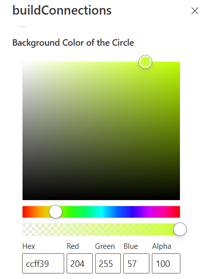
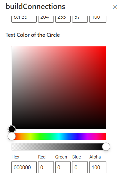
| Background Color of the Circle | Color Picker | #CCFF39 | Customize the background color of the circle. |
| Text Color of the Circle | Color Picker | #0000000 | Customize the Text Color of the circle. |
📌 Usage Notes
- By default, mock data is shown with 5 sample items if no list is connected.
- If the connected list contains more than 5 items, the carousel view is automatically enabled.
- The Items to display slider allows customization between 5 to 10 items. The default is 5.
- If 5 or fewer items are selected to display, the carousel will not be enabled and a static layout is shown.
- If the Icon column contains an image, it will be displayed in the UI instead of the user's mock data.
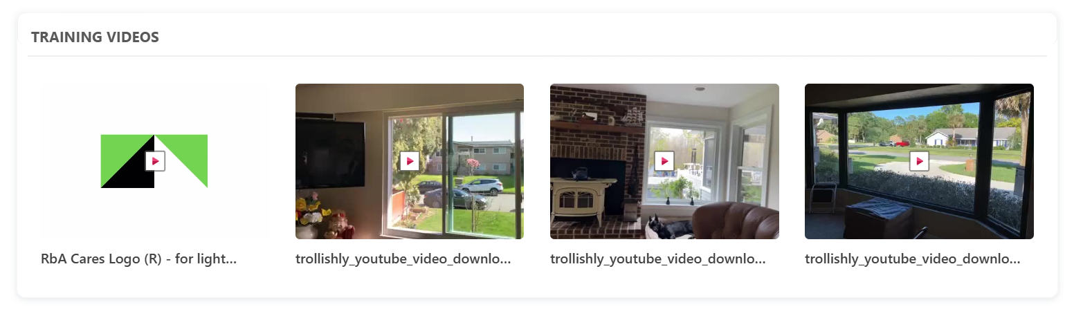
6. 📽️ Training Videos
📋 Details
- The Training Video web part helps streamline employee onboarding by embedding essential training materials directly into the SharePoint experience.
- It supports various video sources to ensure new hires can access learning content quickly and efficiently.
- Horizontal Carousel Navigation allows users to browse through available documents using left and right arrows.
🛠️ Training Videos Web Part – Property Pane Configuration
Configure the Training Videos web part using the following options:
📸 View Property Pane Screenshots
| Field | Type | Default / Example | Description |
|---|
| Show Webpart Title | Toggle | Yes | Toggle switch to show or hide the web part title. |
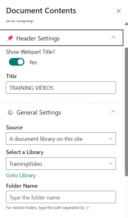
| Title | TextBox | TRAINING VIDEOS | Text field to define the web part name. |
⚙️ General Settings
| Field | Type | Default / Example | Description |
|---|
| Source | Dropdown | A document library on this site | Choose which SharePoint document library to display. By default, "A document library on this site" is selected. |
| Select a Library | Dropdown | TrainingVideo | Dropdown to choose a library from the site |
| Folder Name | Text | (Blank) | Optionally enter a folder path to display only files from a specific folder. |
🎨 Appearance Settings
| Field | Type | Default / Example | Description |
|---|
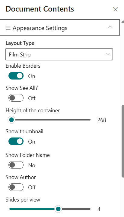
| Layout Type | Dropdown | Film Strip | Controls how content is visually displayed. |
| Enable Borders | Toggle | On | Toggle to show/hide borders around items |
| Show See All | Toggle | Off | Toggle to display a "See All" link |
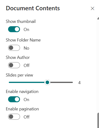
| Show thumbnail | Toggle | On | Toggle to display file previews |
| Show Folder Name | Toggle | Off | Toggle to display folder names |
| Show Author | Toggle | Off | Toggle to show the file creator |
| Slides per View | Slider | 4 | Number of items shown per slide |
| See All Link | Text | (Blank) | Custom URL for "See All" button |
| Enable Navigation | Toggle | On | Toggle to enable left/right carousel arrows |
| Enable Pagination | Toggle | Off | Toggle to enable pagination controls |
📌 Usage Notes
- By default, the web part displays the TrainingVideo library, but you can select any available document library on your site.
- You can filter to a specific folder by entering its path in the Folder field (use "/" for nested folders).
- Select a custom view to display files as needed, and adjust the size and command bar visibility to match your page layout and user needs.
- The "See All" link provides quick access to the full document library.
- Always click Apply in the property pane after making changes to ensure your configuration is saved and visible.
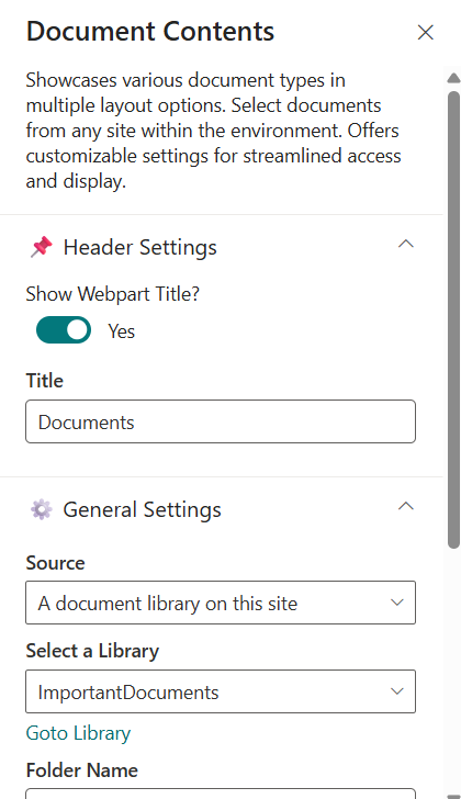
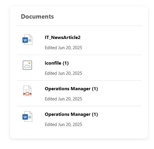
7. 🗂️ Important Documents
📋 Details
- Important Documents Web Part displays documents in a row view layout.
- Vertical scroll allows users to browse through available documents.
🛠️ Important Documents Web Part – Property Pane Configuration
Configure the Important Documents web part using the following options:
📸 View Property Pane Screenshots
| Field | Type | Default / Example | Description |
|---|
| Show Webpart Title | Toggle | Yes | Toggle switch to show or hide the web part title. |
| Title | TextBox | Documents | Text field to define the web part name. |
⚙️ General Settings
| Field | Type | Default / Example | Description |
|---|
| Source | Dropdown | A document library on this site | Choose which SharePoint document library to display. By default, "A document library on this site" is selected. |
| Select a Library | Dropdown | Important Documents | Dropdown to choose a library from the site |
| Folder Name | Text | (Blank) | Optionally enter a folder path to display only files from a specific folder. |
🎨 Appearance Settings
| Field | Type | Default / Example | Description |
|---|
| Layout Type | Dropdown | Row View | Controls how content is visually displayed. |
| Enable Borders | Toggle | On | Toggle to show/hide borders around items |
| Show See All | Toggle | Off | Toggle to display a "See All" link |
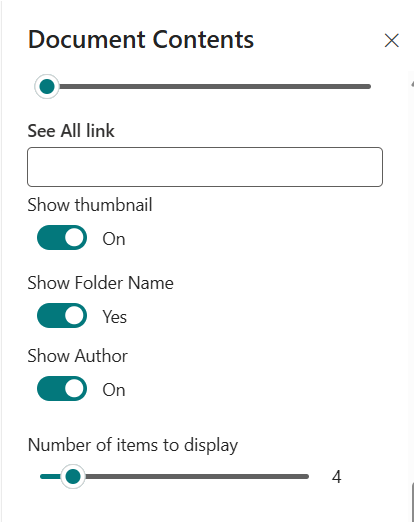
| Show thumbnail | Toggle | On | Toggle to display file previews |
| Show Folder Name | Toggle | Off | Toggle to display folder names |
| Show Author | Toggle | Off | Toggle to show the file creator |
| Slides per View | Slider | 4 | Number of items shown per slide |
| See All Link | Text | (Blank) | Custom URL for "See All" button |
| Enable Navigation | Toggle | On | Toggle to enable left/right carousel arrows |
| Enable Pagination | Toggle | Off | Toggle to enable pagination controls |
| Height of the container | Slider | 300px | Customize the Height of Documents container to disbale the scroll |
| Number of items to display | Slider | 4 | Customize the number of documents to show |
📌 Usage Notes
- By default, the web part displays the ImportantDocuments library, but you can select any available document library on your site.
- You can filter to a specific folder by entering its path in the Folder field (use "/" for nested folders).
- Select a custom view to display files as needed, and adjust the size and command bar visibility to match your page layout and user needs.
- The "See All" link provides quick access to the full document library.
- Always click Apply in the property pane after making changes to ensure your configuration is saved and visible.
- You can Customize the Height of the container to override the scroll.
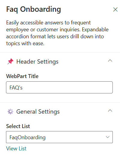
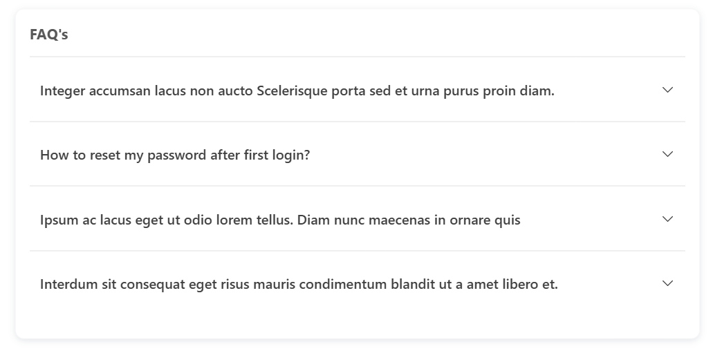
8. ❓FAQs
📋 Details
Provide a centralized knowledge base for commonly asked questions:
- Self-Help Portal: Easily accessible answers to frequent employee or customer inquiries.
- Smart Navigation: Expandable accordion format lets users drill down into topics with ease.
List Config
For the FAQ webpart, create a list with the following columns.
📋 Required Columns
| 🏷️ Column Name (Case Sensitive) | 🔣 Column Type | Column Value |
|---|
| FaqQuestion | Text | Any Question for FAQ |
| FaqAnswer | Multiple lines of Text | Any Answer for FAQ |
🛠️ FAQ Web Part – Property Pane Configuration
Configure the FAQ web part using the following options:
📸 View Property Pane Screenshots
| Field | Type | Default / Example | Description |
|---|
| WebPart Title | TextBox | FAQ's | Text field to define the web part name. |
⚙️ General Settings
| Field | Type | Default / Example | Description |
|---|
| Select List | DropDown | BuildConnections | Specifies the SharePoint list to pull buildConnections. |
| View List | Hyperlink | - | On Click of it, will redirect to particular list. |
🎨 Appearance Settings
| Field | Type | Default / Example | Description |
|---|
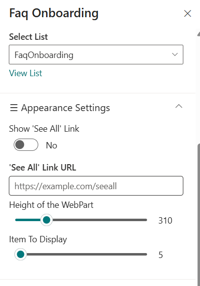
| Show 'See All Link' | Toggle | Off | Toggle to display a "See All" link |
| See All Link URL | Text | (Blank) | Custom URL for "See All" button |
| Height of the container | Slider | 310px | Customize the Height of Documents container to disbale the scroll |
| Items to display | Slider | 5 | Customize the items to display in build connections. |
📌 Usage Notes
- You can Customize the Height of the container to override the scroll.
- View List link provides quicker access to list