Configuration
This guide provides step-by-step configuration details for each web part, including list setups, property pane settings, and appearance options.
📚 Table of Contents
- Welcome Banner
- Announcements
- Quicklinks
- News
- Message Center
- Employee Spotlights
- Testimonials
- Company Directory
- Calendar
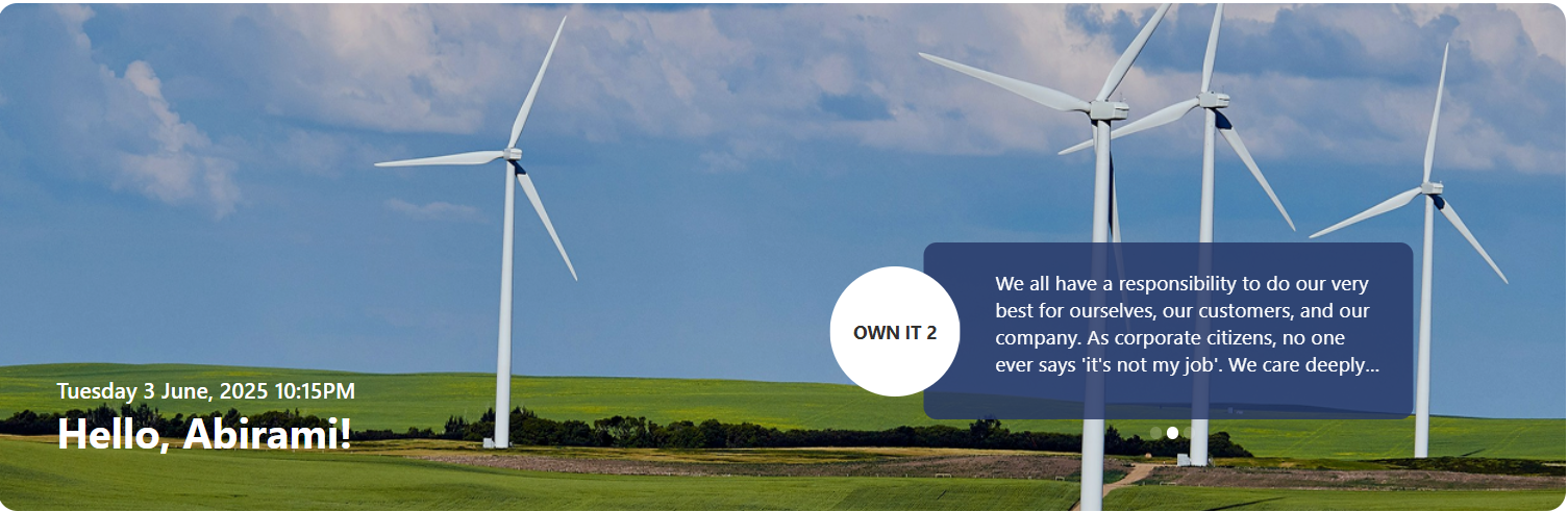
🏞️ 1. Welcome Banner
A personalized banner that greets users with their name, current date & time, and a motivational corporate message.
🧱 List Configuration
Note: Create a SharePoint list named
Bannerwith the following columns:
| 🏷️ Column Name (Case Sensitive) | 🔣 Column Type | Description |
|---|---|---|
| Title | Text (default field) | Banner headline |
| Description | Multiple lines of text | Message content |
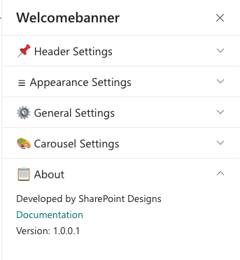
⚙️ Property Pane Configuration
📸 View Property Pane Screenshot
🔖 Header Settings
| 🏷️ Name | 🎯 Purpose | 💡 Select Option/Type |
|---|---|---|
| Title | Displays a personalized greeting (e.g., "Hello") | Textbox |
| Format Date and Time | Shows the current date & time | Date-Time Picker |
| Display Name | Choose whether to display First, Last, or Full Name | Dropdown (First/Last/Full) |
🎨 Appearance Settings
| 🏷️ Name | 🎯 Purpose | 💡 Select Option/Type |
|---|---|---|
| Background Image | Upload or select banner background | Image Selector |
| Height of Banner | Sets vertical banner height (px) | Slider (e.g., 390 px) |
| Height of Content Banner | Sets content area height (px) | Slider (e.g., 135 px) |
⚙️ General Settings
| 🏷️ Name | 🎯 Purpose | 💡 Select Option/Type |
|---|---|---|
| Select the list | Source SharePoint list | Dropdown (e.g., Banner) |
| Hide Icon | Show/hide arrow icon in message circle | Toggle (No) |
| No of items to display | Limit items displayed in banner | Slider (e.g., 3) |
| Background color | Background color of content area | Color Picker |
🎠 Carousel Settings
| 🏷️ Name | 🎯 Purpose | 💡 Select Option/Type |
|---|---|---|
| Enable AutoPlay | Enable automatic slide rotation | Toggle (Yes/No) |
| Autoplay Speed | Delay between slides (ms) | 8000 |
📢 2. Announcements
Rotating announcement cards that display headlines, short descriptions, and a Learn More button — great for internal updates and campaigns.

🧱 List Configuration
Create a list named
Announcementswith these columns:
| 🏷️ Column Name (Case Sensitive) | 🔣 Column Type | Description |
|---|---|---|
| Description | Multiple lines of text | Announcement text |
| Link | Hyperlink | “Learn More” destination |
| Orderby | Number | Display order |
| TargetWindow | Choice (Open in new tab / self tab) | Controls link behavior |
| ExpiryDate | Date and Time | Hide expired announcements automatically |
⚙️ Property Pane Configuration
📸 View Property Pane Screenshot
📌 Header Settings
| 🏷️ Name | 🎯 Purpose | 💡 Select Option/Type |
|---|---|---|
| Show Web Part Title | Toggle visibility of title | Switch (On/Off) |
| Web Part Title | Sets the section title | Text Input |
⚙️ General Settings
| 🏷️ Name | 🎯 Purpose | 💡 Select Option/Type |
|---|---|---|
| Select a List | Source list for announcements | Dropdown (e.g., Announcements) |
| Background Image | Upload custom background | Image Selector |
| Button Hover Theme | Defines hover colors (text + background) | Dropdown (Theme 5: Text #fff, BG #243666) |
| Preview | Live preview of hover theme | Visual Display |
| Show Arrows | Show/hide navigation arrows | Switch (On/Off) |
| View List | Open the SharePoint list in new tab | Hyperlink (View List) |
🎠 Carousel Settings
| 🏷️ Name | 🎯 Purpose | 💡 Select Option/Type |
|---|---|---|
| Enable AutoPlay | Automatic slide rotation | Toggle (Yes/No) |
| Autoplay Speed | Delay between slides (ms) | 8000 |
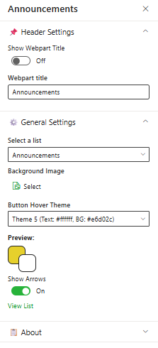
🔗 3. Quicklinks
Offer one-click access to frequently used tools, policies, or external resources with customizable icons and layouts.
🧱 List Configuration
Create a list named
QuickLinkswith the following columns:
| 🏷️ Column Name (Case Sensitive) | 🔣 Column Type | Description |
|---|---|---|
| Icon | Image | Tile icon |
| URL | Hyperlink | Target link |
| Order | Number | Item ordering |
| TargetWindow | Choice (Yes/No) | Opens in new tab if “Yes” |
⚙️ Property Pane Configuration
📸 View Property Pane Screenshot
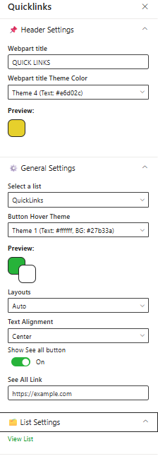
📌 Header Settings
| 🏷️ Name | 🎯 Purpose | 💡 Select Option/Type |
|---|---|---|
| Web Part Title | Title displayed on web part | “Quick Links” |
| Web Part Title Theme Color | Sets theme color for title | Dropdown (Theme 3: #243666) |
| Preview | Displays theme preview | Color Block Display |
⚙️ General Settings
| 🏷️ Name | 🎯 Purpose | 💡 Select Option/Type |
|---|---|---|
| Select a List | Source SharePoint list | Dropdown (QuickLinks) |
| Items to Show | Limit visible items | Slider (8) |
| Button Hover Theme | Hover style for buttons | Dropdown (Theme 1: BG #227c70) |
| Layouts | Layout type for tiles | Dropdown (Auto) |
| Text Alignment | Alignment for labels | Dropdown (Center) |
| Show See All Button | Toggle visibility of “See All” | Switch (On/Off) |
| See All Link | URL for “See All” action | Text box (https://example.com) |
📁 List Settings
| 🏷️ Name | 🎯 Purpose | 💡 Select Option/Type |
|---|---|---|
| View List | Open the connected SharePoint list | Hyperlink (View List) |
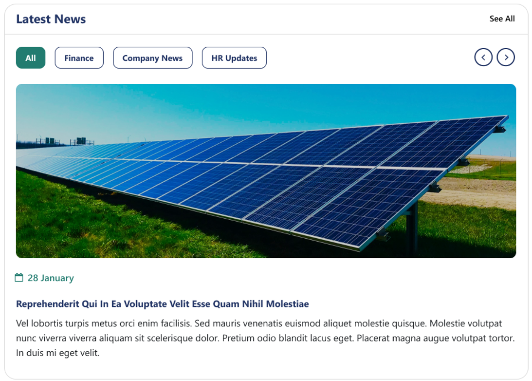
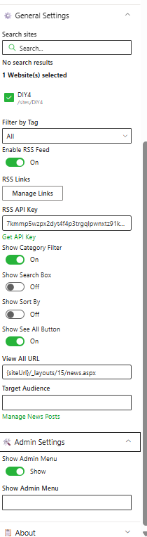
📰 4. News
Deliver the latest updates and announcements through a dynamic, filterable news section featuring categories, sorting, and RSS integration.
⚙️ Property Pane Configuration
📸 View Property Pane Screenshots
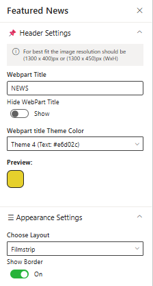
🛠️ Header Settings
| 🏷️ Name | 🎯 Purpose | 💡 Select Option/Type |
|---|---|---|
| Webpart Title | Display title of the news section | Textbox (e.g., NEWS) |
| Hide WebPart Title | Toggle title visibility | Switch (Show/Hide) |
| Webpart Title Theme Color | Set the theme color | Dropdown (Theme 3: #243666) |
| Preview | Show color preview | Color Block Display |
🎨 Appearance Settings
| 🏷️ Name | 🎯 Purpose | 💡 Select Option/Type |
|---|---|---|
| Choose Layout | Select display style (e.g., Filmstrip) | Dropdown |
| Show Border | Toggle border visibility | Switch (On/Off) |
⚙️ General Settings
| 🏷️ Name | 🎯 Purpose | 💡 Select Option/Type |
|---|---|---|
| Search Sites | Define source site collections | Search Box |
| Filter by Tag | Display filtered news by tag | Dropdown (“All”) |
| Enable RSS Feed | Fetch external RSS feeds | Toggle (On) |
| RSS Links | Manage RSS links | Manage Links button |
| RSS API Key | Enter API Key for secure access | Textbox |
| Get API Key | Generate or retrieve API Key | Button |
| Show Category Filter | Enable filtering by categories | Toggle (On) |
| Show Search Box | Add search functionality | Toggle (Off) |
| Show Sort By | Enable sorting | Toggle (Off) |
| Show See All Button | Include “See All” navigation | Toggle (On) |
| View All URL | Destination for full news list | {siteUrl}/_layouts/15/news.aspx |
| Target Audience | Restrict visibility by audience | Textbox |
| Manage News Posts | Open the list for content editing | Manage News Posts button |
🛠️ Admin Settings
| 🏷️ Name | 🎯 Purpose | 💡 Select Option |
|---|---|---|
| Show Admin Menu | Enable admin controls | Toggle (Show) |
| Additional Config | Define extended settings | Textbox |
Use descriptive tags and consistent images (1300×450 px) for better layout alignment and category filtering.
💬 5. Message Center
Display personalized messages from leadership (e.g., CEO message) with profile image, name, and title, presented in a clean visual layout.
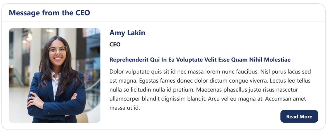
Perfect for high-impact internal communications — easily configurable via Webpart property panel.
⚙️ Property Pane Configuration
📸 View Property Pane Screenshot
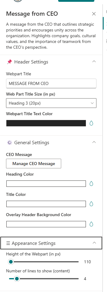
📌 Header Settings
| 🏷️ Name | 🎯 Purpose | 💡 Select Option/Type |
|---|---|---|
| Web Part Title | Section title (e.g., “Message from the CEO”) | Textbox |
| Web Part Title Size | Choose title heading level | Dropdown (Heading 2/3/4) |
| Webpart Title Text Color | Define title text color | Color Picker |
⚙️ General Settings
| 🏷️ Name | 🎯 Purpose | 💡 Select Option/Type |
|---|---|---|
| Manage CEO Message | Add/Edit CEO message content | Button (Add/Edit) |
| Heading Color | Heading text color | Color Picker |
| Title Color | Sub-title or name color | Color Picker |
| Overlay Header Background Color | Overlay color for top header | Color Picker |
🗂️ Appearance Settings
| 🏷️ Name | 🎯 Purpose | 💡 Select Option/Type |
|---|---|---|
| Height of Web Part | Set the visual height of the web part (px) | Number Input |
| No. of Lines to Show (Content) | Limit visible lines for preview | Slider |
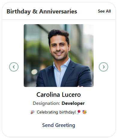
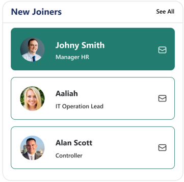
🌟 6. Employee Spotlights
Celebrate your people! Showcase birthdays, anniversaries, and new joiners with vibrant cards or carousel views.
🧱 List Configuration
Create a list named
EmployeeSpotlightswith the following columns:
| 🏷️ Column Name (Case Sensitive) | 🔣 Column Type | Description |
|---|---|---|
| Person | Person or Group | Employee name reference |
| Designation | Text | Job title or role |
| ProfileImage | Image | Employee photo |
| Date | Date and Time | Event date |
| Category | Choice | Birthday / Anniversary / New Joiner |
⚙️ Property Pane Configuration
📸 View Property Pane Screenshot
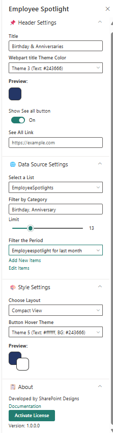
🧷 Header Settings
| 🏷️ Name | 🎯 Purpose | 💡 Select Option |
|---|---|---|
| Title | Section title | “Birthday & Anniversaries” |
| Webpart Title Theme Color | Theme color for title | Theme 3 (Text: #243666) |
| Show See All Button | Toggle to display “See All” | On |
| See All Link | Destination URL | https://example.com |
🌐 Data Source Settings
| 🏷️ Name | 🎯 Purpose | 💡 Select Option |
|---|---|---|
| Select a List | Choose SharePoint data list | EmployeeSpotlights |
| Filter by Category | Filter items by event type | Birthday / Anniversary |
| Limit | Limit number of spotlight cards | Slider (15) |
| Filter the Period | Define date range for events | Last Month |
| Add/Edit Items | Open list for modification | Add/Edit Items |
🎨 Style Settings
| 🏷️ Name | 🎯 Purpose | 💡 Select Option |
|---|---|---|
| Choose Layout | Select between Carousel or Compact view | Carousel View |
| Button Theme | Button hover color and text color | Theme 4 (Text #243666, BG #fff) |
| Greeting Message | Customize greeting button text | “Send Greeting” |
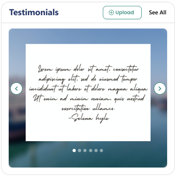
💭 7. Testimonials
Highlight client or employee feedback in a visually appealing carousel view with profile images and quotes.
⚙️ Property Pane Configuration
📸 View Property Pane Screenshot
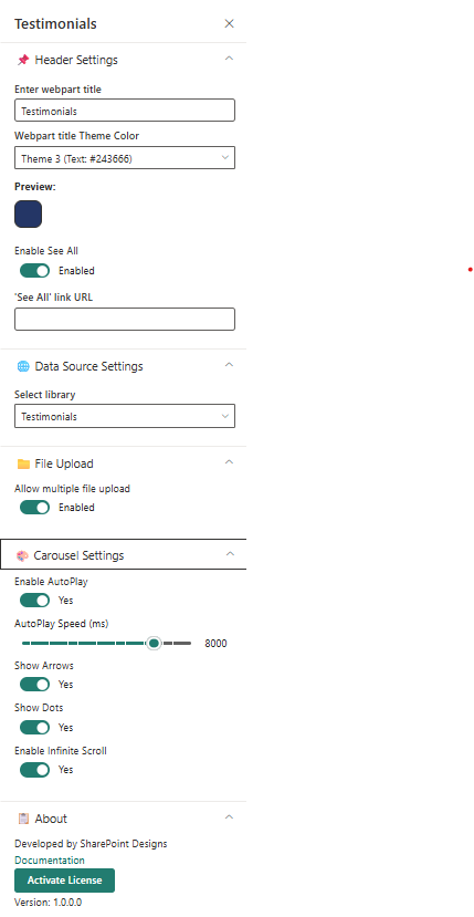
📌 Header Settings
| 🏷️ Name | 🎯 Purpose | 💡 Select Option/Type |
|---|---|---|
| Web Part Title | Title displayed above the section | Textbox (“Testimonials”) |
| Webpart Title Theme Color | Color theme for section heading | Dropdown (Theme 3 #243666) |
| Preview | Displays live theme preview | Color Block Display |
🌐 Data Source Settings
| 🏷️ Name | 🎯 Purpose | 💡 Select Option |
|---|---|---|
| Select a Library | Library containing testimonial items | Testimonials |
🗂️ File Upload Settings
| 🏷️ Name | 🎯 Purpose | 💡 Select Option |
|---|---|---|
| Allow Multiple File Upload | Enable batch upload of testimonial images | Enabled |
🎠 Carousel Settings
| 🏷️ Name | 🎯 Purpose | 💡 Select Option |
|---|---|---|
| Enable AutoPlay | Automatically cycle through testimonials | Yes |
| AutoPlay Speed (ms) | Slide-change speed | 8000 |
| Show Arrows | Display navigation arrows | Yes |
| Show Dots | Show pagination dots | Yes |
| Enable Infinite Scroll | Loop carousel endlessly | Yes |
Use a consistent photo size (e.g., 200×200 px) and keep testimonial text under 120 characters for balance.
🏢 8. Company Directory
Display your organizational hierarchy with interactive nodes showing employees, departments, and reporting lines.
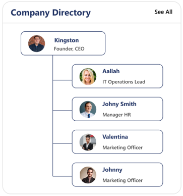
Ideal for visualizing reporting structures — users can hover to view names, titles, and contact details.
⚙️ Property Pane Configuration
📸 View Property Pane Screenshot
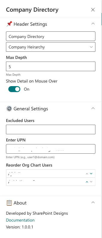
📌 Header Settings
| 🏷️ Name | 🎯 Purpose | 💡 Select Option/Type |
|---|---|---|
| Web Part Title | Title displayed above the chart | “Company Directory” |
| Webpart Title Theme Color | Choose theme color | Dropdown (Theme 3 #243666) |
| Preview | Displays color preview | Color Block Display |
🧭 Main Settings
| 🏷️ Name | 🎯 Purpose | 💡 Select Option |
|---|---|---|
| Company Hierarchy | Select data source for org chart | Company Hierarchy |
| Max Depth | Control number of levels shown | 5 |
| Show Detail on Mouse Over | Display employee detail tooltip | On |
⚙️ General Settings
| 🏷️ Name | 🎯 Purpose | 💡 Select Option |
|---|---|---|
| Excluded Users | Remove specific users from chart | People Picker |
| Enter UPN | Activate reorder option by valid email ID | Text Input |
| Reorder Org Chart Users | Reorder children under a parent node | Text Input |
📘 About
| 🏷️ Name | 🎯 Purpose | 💡 Select Option |
|---|---|---|
| Developed By | Credit attribution | SharePoint Designs |
| Documentation | Opens help documentation | Documentation Link |
📅 9. Calendar
Show upcoming meetings, holidays, and key events in a clear monthly or weekly calendar format.
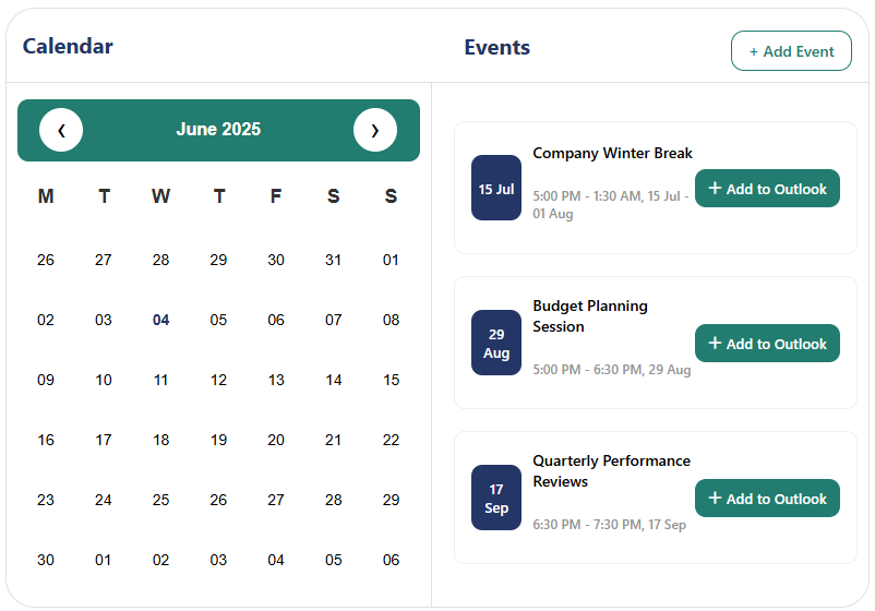
The Calendar web part pulls events directly from a SharePoint list, helping teams stay informed about important dates.
⚙️ Property Pane Configuration
📸 View Property Pane Screenshot
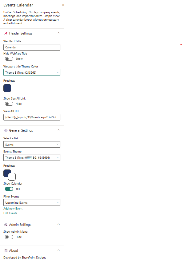
📌 Header Settings
| 🏷️ Name | 🎯 Purpose | 💡 Select Option |
|---|---|---|
| Web Part Title | Title displayed at the top | “Event Calendar” |
| Webpart Title Theme Color | Color theme for title | Dropdown (Theme 3 #243666) |
| Preview | Displays color preview | Color Block Display |
| Show See All Link | Display link to full events view | Show |
| View All URL | Destination for full events page | {siteUrl}/_layouts/15/Events.aspx?ListGuid=... |
⚙️ General Settings
| 🏷️ Name | 🎯 Purpose | 💡 Select Option |
|---|---|---|
| Select a List | Choose event list source | Events |
| Show Calendar | Toggle calendar view display | Yes |
| Filter Events | Filter types (Upcoming / Past / All) | Upcoming Events |
| Add/Edit Events | Link to manage list items | Add/Edit Events |
📘 Developed by: SharePoint Designs